
Tuesday, May 9, 2017
Funny Design - May 9 (Extra for final blog)
This is an ad for "Nonuts" peanut butter. The function of this ad is to attract people to the product and show how desirable this peanut butter is. Nonuts peanut butter is a spread that tastes like peanut butter, but contains no nuts. The purpose of this product is to be peanut butter for those who are allergic to it. The designer does a great job creating a funny and attractive design with his use of an unrealistic situation. He shows a squirrel with the entire jar in its mouth to show how this squirrel likes it, despite containing no nuts, and couldn't resist eating the whole thing. I found this design very captivating - so much so that I had to view it just by the image. It also is a silly and kid-friendly design, which is useful because many consumers are likely children. The designer also uses colors that remind me of the color of nuts (tannish-yellow colors), which makes me a little hungry since I enjoy peanuts a lot. The designer is effective in showcasing the product in an appealing and captivating way.
 Communication arts magazine

Bad Design - May 3
This is a photo of a "Full cream milk" box. I'm really not sure what the function of this packaging is, because it is super unappealing. To be sold in the present day would be a disgrace to packaging. The box uses an incredibly saturated green that messes with your eyes just looking at it. The illustration of flowers doesn't really have anything to do with the fact that the container is for milk. And the overall art style of the box, especially the illustration, is very retro and feels like a 1940's or 1950's box, not one that should be used (or seen) in the present.
 Communication arts magazine

Retro Design - Apr. 26
This is an advertisement for a fabric brand called Perennials. The function of this ad is to show how long-lasting the fabrics Perennials sells are. The image shows a man who looks like he's just finished a war, standing on a pile of pillows made with Perennials fabrics. The whole design looks very rough and beaten down, but the pillows still look smooth and nice. The designer does a good job of showing how the fabric lasts a long time by creating the contrast between the pillows and the rest of the art. The pillows have a bright color while the image has a dull color, and the pillows look smooth and the image looks rough. I chose this image because it has a very retro feel to it. It uses post-war elements that remind me of the very early 1900's, like something you would see around WWI or WWII.
 Communication arts magazine

Monday, May 8, 2017
Contemporary Design - Apr. 19
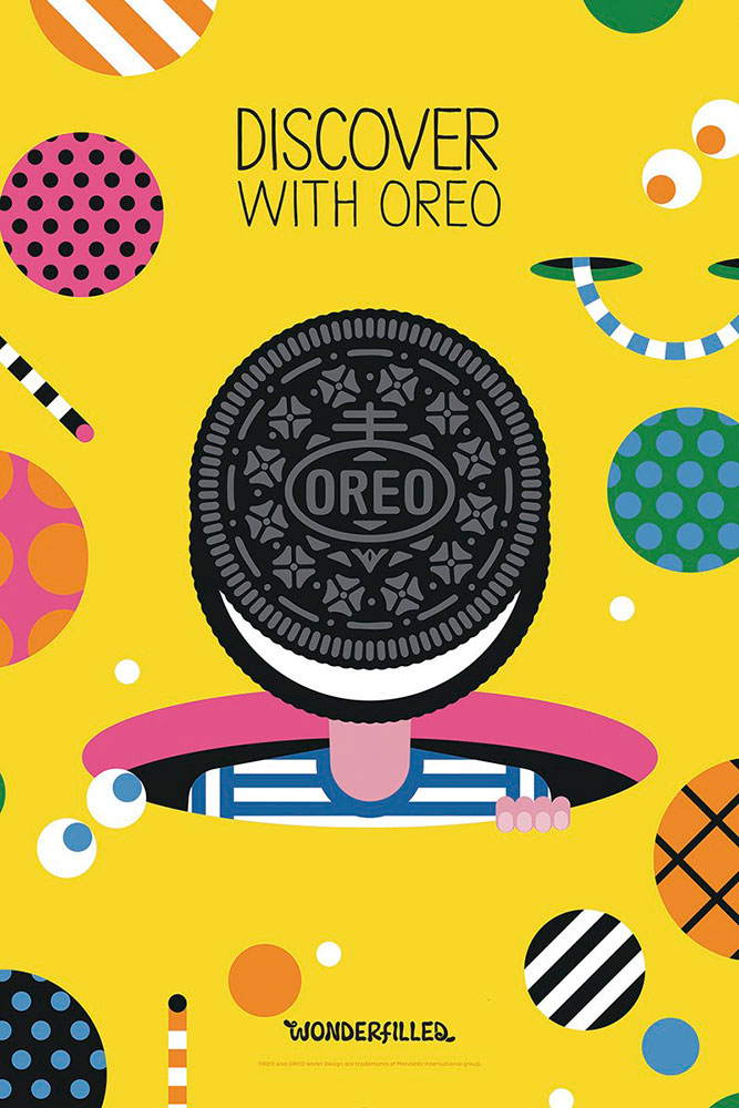
This is an ad for Oreo cookies. The function of the ad is to make Oreo cookies look like a unique flavor experience, where by eating them, you are "discovering". The ad is part of the Oreo "Wonder" experience. The goal of the campaign is probably to showcase all the flavors of Oreos and how you can have a great eating experience with them. What stood out to me, though, was the illustration. It is a great contemporary design that showcases an Oreo cookie, surrounded by a bunch of other circles filled with patterns. Through this great illustration, the designer gives off a very fun feel, which is probably very attractive to Oreo fans, especially younger children. I liked the simplistic and colorful contemporary feel that the design gives off, and it helped grab my attention with the minimalism. I'm not sure if the designer did the best job making Oreos look "Adventurous" or filled with "Wonder", but they did do a great job of grabbing your attention and making the cookie look very appealing.
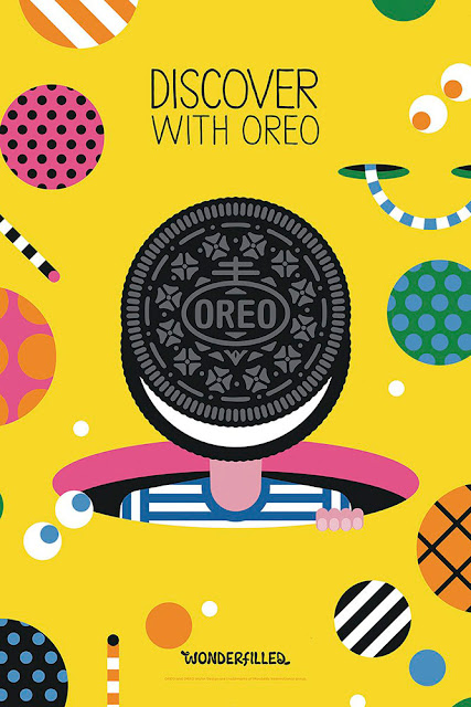 Taken from Communication Arts Magazine
Identity Design - Apr. 12
This is an advertisement for Ziploc bags. The function of this design is to show the chaos that can ensue when you don't have proper containers to store things in - like ziploc bags. The designer captures your attention by creating a huge mess that instantly captures your attention. He then places the classic Ziploc logo right in the middle of the mess to show what the ad is about and what you need to solve the big mess problem. I found it really cool how the logo looks nice and clean right in the center of the giant mess. That probably can represent how clean things will be if you have the right containers to store things with many small parts. The designer does a great job presenting a large problem and the proper solution to the problem in a way that captures your attention.
 Taken from Communication Arts Magazine

Digital Media Design - Apr. 5
This is a super bowl ad for Budweiser beer. The function of this commercial was to showcase the journey the company's founder took to start the Anheiser-Busch company and brew such a famous beer. I liked the short-film style visuals the filmmaker used. The entire ad also has a very historic feel to it, including the classic Budweiser logo (and text going along with it) at the end. The filmmaker wanted to give the ad an adventurous feel and show how tough it was for the founder to come to the US and start his company. Giving the film a dirty, gritty feel with the use of intense tones, fire, and darkness adds to the overall feel. The filmmaker does a good job of accomplishing the goal of showing how much work was put into starting this massive company. That also can help viewers realize how much work and thought was put into their products.
I saw this on TV while watching the Super Bowl
Foreign Design - Mar. 29
This design appears to be a French design. While I can't read the full design, the function of the ad appears to be showing someone being strangled by businessmen, likely referring to mail in the mailboxes he is by. I really like the photography and overall visuals in this ad. It has a very cinematic feel to it, and looks almost like it would be a movie cover or poster. The metaphor behind the design might be to show the man being consumed by advertisements and sales pitches from the mail, which is something that is common to everyone. People are always trying to sell us things, and the artist does a good job of showing that with the design. I feel as though he does a good enough job of sending the message across, that you don't even need to be able to read the text.
 Taken from Communication Arts Magazine

Subscribe to:
Posts (Atom)