Monday, May 8, 2017
Digital Media Design - Apr. 5
This is a super bowl ad for Budweiser beer. The function of this commercial was to showcase the journey the company's founder took to start the Anheiser-Busch company and brew such a famous beer. I liked the short-film style visuals the filmmaker used. The entire ad also has a very historic feel to it, including the classic Budweiser logo (and text going along with it) at the end. The filmmaker wanted to give the ad an adventurous feel and show how tough it was for the founder to come to the US and start his company. Giving the film a dirty, gritty feel with the use of intense tones, fire, and darkness adds to the overall feel. The filmmaker does a good job of accomplishing the goal of showing how much work was put into starting this massive company. That also can help viewers realize how much work and thought was put into their products.
I saw this on TV while watching the Super Bowl

Foreign Design - Mar. 29
This design appears to be a French design. While I can't read the full design, the function of the ad appears to be showing someone being strangled by businessmen, likely referring to mail in the mailboxes he is by. I really like the photography and overall visuals in this ad. It has a very cinematic feel to it, and looks almost like it would be a movie cover or poster. The metaphor behind the design might be to show the man being consumed by advertisements and sales pitches from the mail, which is something that is common to everyone. People are always trying to sell us things, and the artist does a good job of showing that with the design. I feel as though he does a good enough job of sending the message across, that you don't even need to be able to read the text.
 Taken from Communication Arts Magazine

Creative Visual Concept - Mar. 22
This is an advertisement for a special "Flexible" type of Band Aids. The function of this ad is to show how flexible and strong these band aids are. When buying band aids, people tend to want ones that will stay on and protect their injury, while not getting in the way and being uncomfortable. The designer of this ad shows the incredible Hulk with a band aid on. In the Hulk comics and movies, Hulk is a normal guy that turns into the big green Hulk everyone knows. Knowing this, a viewer would know that Hulk gets a lot bigger when he turns into the green superhero. The band aid in the ad looks like it's still on strong, even though it got stretched out a lot. I found this ad very creative because of the funny use of a superhero in the ad. I think the designer's work on this ad is effective in showing the strength of the product, which is what he was going for.
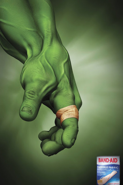 Taken from Communication Arts Magazine

Creative Typography - Mar. 15
This is an advertisement for a company called Jashanmal books. The function of this ad appears to be to show off either the company's simplistic book covers, or to show off the fact that they offer many classic novels. I selected this ad because of its creative use of typography. The designer manipulated the text to reflect something about the book (sort of like Chip Kidd does with his entire covers). In the Sherlock Holmes book cover, the designer turned the "O" and the "L" into a magnifying glass. In the "TKAM" cover, he made the "I" in "Kill" look like a dead person - who was obviously killed. And in the Moby Dick cover, he made the "Y" and "D" look like a whale. I found these simplistic advertisements very interesting to look at with the use of making images out of typography. I think that the designer is effective in both capturing viewer's attention and giving a glimpse into maybe what the book is about through his use of typography.


Taken from Communication Arts Magazine
Tuesday, March 14, 2017
Whole Foods - Mar. 14 (Extra for midterm)

This Whole Foods ad was pulled from the September - October 2016 issue of Communication Arts. The function of the design is to show that Whole Foods contains many fresh, hand-harvested, organic foods. The designer uses photography for most of the design, while only adding the Whole Foods logo on digitally. He makes the majority of the design green, to give a natural, lively, organic, fresh feel. The color green gives the feeling of life and freshness, which is what he wanted to show about the food you can find at Whole Foods. He also shows two women picking vegetables (or fruits) that would be found at Whole Foods. It gives the impression that their food is grown and sold with love, as opposed to commercial harvesting of foods, which can often lower the quality of the food. The designer uses emphasis with the logo being in contrast with the sky, and centered on the design, while having the viewer create implications on their own.
Canada Music - Mar. 14 (Extra for midterm)

I found this design in the September - October 2016 issue of Communication Arts. The function of this design is to showcase elements of the nature in Canada through music. The designer makes five lines with leaves placed throughout the lines to resemble music notes. In this design, he uses natural (green) colors to give a fresh, lively, and friendly feeling. It also gives off a good mood to positively represent the music and culture of Canada. The notes are made up of objects commonly found in Canada to show that the music is Canadian. The artist has a series of this design about Canadian music, and each one contains notes made up of different things you can commonly find in Canada (geese, mountains, flowers, etc...), and he writes on the bottom about how Canadian musicians create brilliant music. I found this ad cool, because my favorite band of all time, Rush, is Canadian, so I have a big appreciation for Canadian music.
Unity - Feb. 8

This is an image I took from the September - October 2016 issue of Communication Arts magazine. The purpose of this design is probably to give off a seductive, or sexy feel by the artist. This art was created using a bunch of small beads or colored balls, and put together to create a woman's mouth contrasted on a blue and yellow(ish) background. It shows unity by the wide variety of colored balls and the specific organization working together to create a large image. The design as a whole contains many small parts, but when looked at together, it is harmonious and pleasing to the eye. The designer did an effective job of creating a complete image with all the small parts, as well as making different parts of the piece, including the teeth, the lips, and the background which is in contrast to the mouth.
Subscribe to:
Posts (Atom)